Freelance
2025
Kärlek Design System
A design system built for Lovable to scale at speed.

Overview
Kärlek is the first comprehensive design system for Lovable. It provides a unified visual language, reusable components, and clear interaction and usage guidelines to help the Lovable team design and build faster, more confidently, and with consistent brand quality.
With clear structure and guidelines, Kärlek enables teams to work more efficiently while creating cohesive, accessible, and delightful experiences across every products.
Context
Lovable needs structure to scale at speed
Lovable is one of the fastest-growing AI startups in the world, focused on making software engineering accessible to everyone. It allows anyone to build apps and websites simply by chatting with AI.
As the product expanded, inconsistent components, styling, and fragmented patterns began to slow teams and dilute the brand experience, highlighting the need for a unified design system.

Solution
Introducing Kärlek Design System
A unified, scalable design system that brings consistency and clarity to Lovable products.
The system includes a robust library of reusable components, a structured Figma kit, an organized token system, and a clear, easy-to-follow documentation.
Discover
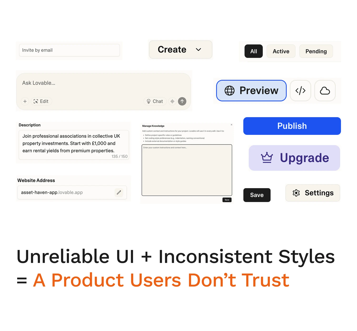
3 major problems uncovered in the audit


Define Kärlek's design principles
These findings helped us shape four design principles for Kärlek, balancing the need for speed and consistency with the flexibility to create clear, accessible experiences across Lovable.

Design
Building a system for Lovable to scale at speed
Getting the foundation right
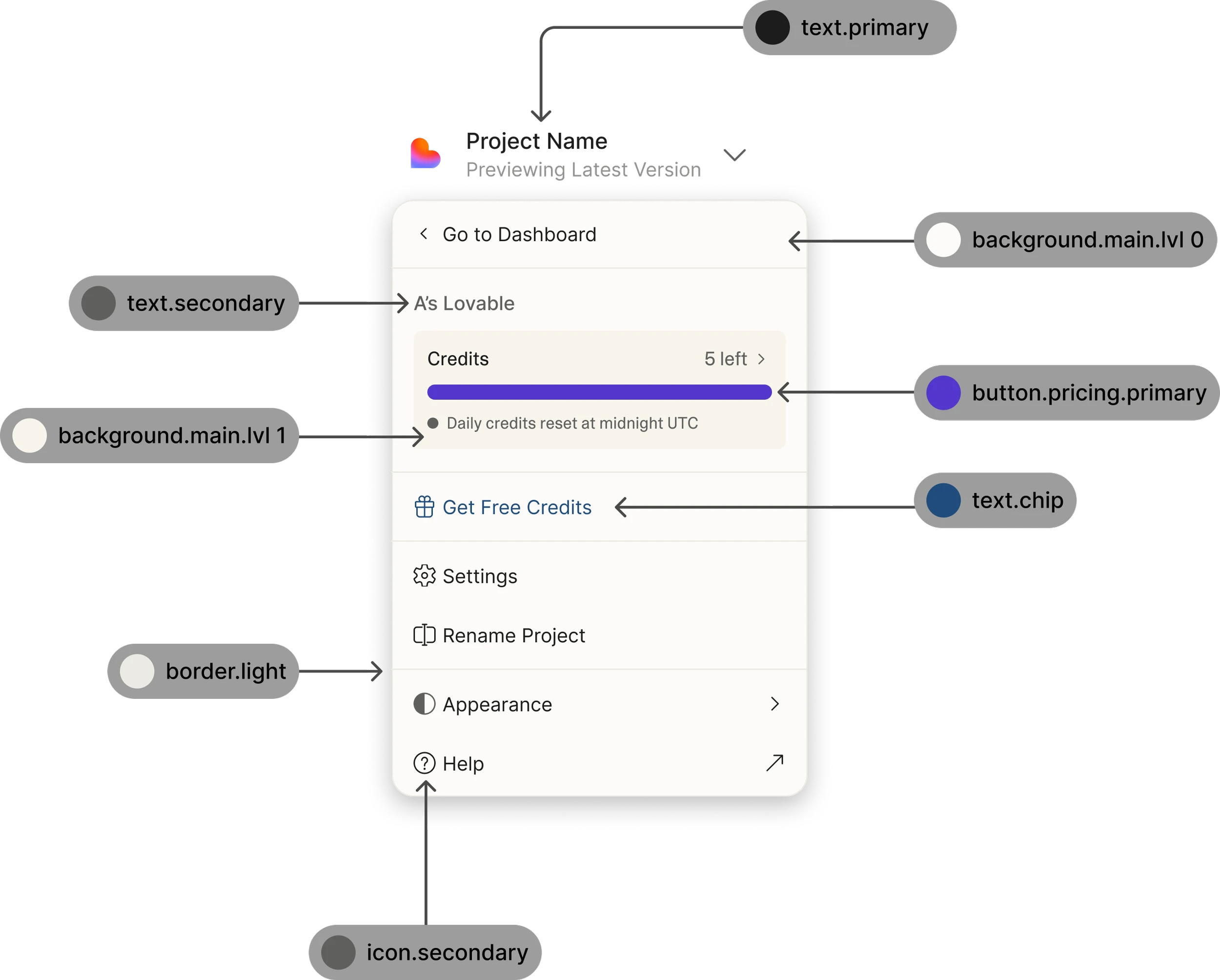
To create a scalable system for Lovable, I led the team in developing design tokens that define core style elements such as color, typography, and spacing.
These tokens establish a shared source of truth, allowing components to adapt across screens and platforms while maintaining a cohesive and recognizable brand identity.

Creating flexible components
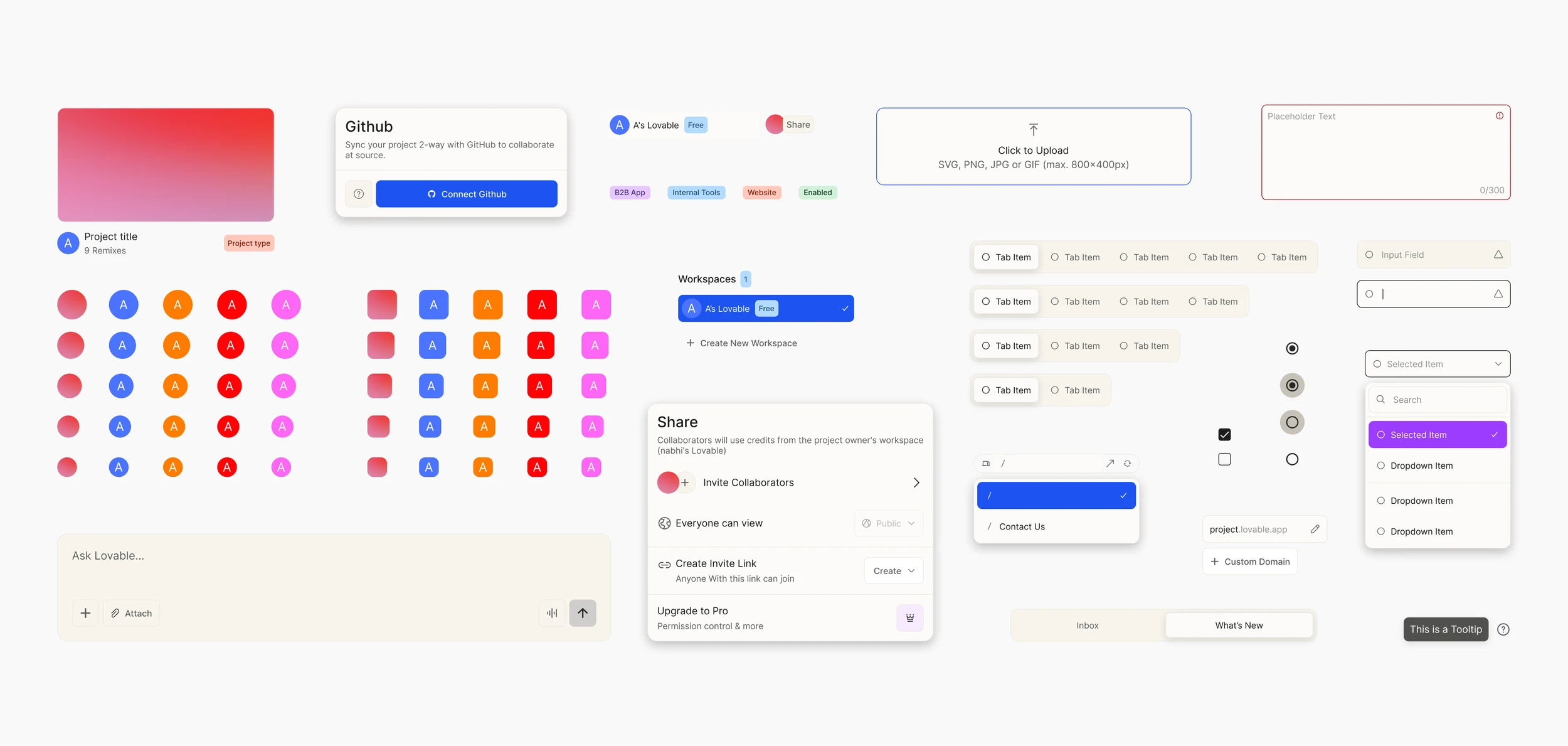
Building on the established foundations, we created a library of reusable components designed for consistency, flexibility, and responsiveness.
Rather than standardizing every interaction into a single pattern, I defined flexible components that could adapt to different product needs while maintaining a cohesive visual language.

Outcome
What Kärlek enables
Built-in support for light & dark modes
Colors are automatically defined to transition across modes, ensuring visual consistency and making designing for modes faster and more efficient.
Adaptive components supporting light and dark modes
Ready-to-use templates built with pre-set components
When Lovable launches a new product or feature, the team no longer starts from zero. They can pull from governed Kärlek components, ensuring every new experience ships on-brand and at a high level of quality from the start.

Template designed for workspace
Balance between standardization and flexibility
While reviewing Lovable’s various menu types, I chose not to force a single standardized pattern, as each menu served a distinct purpose.
To preserve usability while maintaining a cohesive design, I developed multiple menu patterns that balance consistency with contextual flexibility.
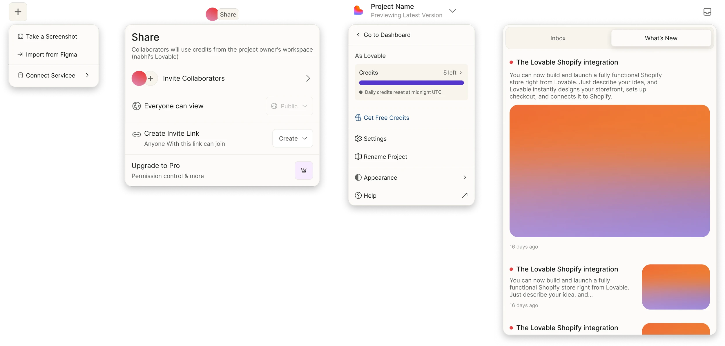
Menus designed for different purposes
Structured guidelines for consistent and scalable design
We hosted Kärlek on Zeroheight to create a single source of truth. It brings together design principles, accessibility standards, components, and usage guidelines in one place, turning a collection of components into a scalable design practice.
This ensures teams stay aligned and allows changes to be implemented smoothly across products.

Find out more about the Kärlek design system on Zeroheight and Figma Community.
Reflections
Building a robust design system
Designing for cohesion at scale
A design system is more than a collection of components. It’s a shared way of working. Cohesion at scale isn’t about making every experience look or behave the same. It’s about creating enough structure for teams to move consistently, while leaving room for different product contexts and needs.
Slow down to speed up
It’s tempting to move quickly when building a system, but early decisions have a way of multiplying downstream. During the tokenization stage, I encouraged the team to slow down and refine the foundation with greater clarity and intention. That extra time ultimately helped us move faster as we built out the system.