
Greenlight Bookstore Website Redesign
Refreshing Greenlight Bookstore’s website to enhance customers’ online book finding and purchasing experience.
About
The redesigned site improves the end-to-end user experience for Greenlight Bookstore customers finding and purchasing books online by introducing updated interaction patterns, optimized information architecture and intuitive navigation. The site is also optimized for mobile use, ensuring a seamless online book shopping experience across devices, which helps Greenlight Bookstore to achieve its business goal.
Project
Team Project
Duration
16 Weeks
My Role
UI design, UX design, User research, Usability Testing
Tools Used
Figma, Miro, Optimal Workshop
Challenge
Greenlight Bookstore’s online presence extends its reach beyond the local neighborhood, allowing customers to browse and purchase books and learn about upcoming events and programs. Greenlight team wants to continue to provide their customers with a top-notch experience, but the current website is at a competitive disadvantage compared to their peers, preventing them from achieving online sales goals.
Our website has grown over time without a clear strategy for handling increasing amounts of information. Its outdated interaction model also prevents our customers from efficiently finding and purchasing books.
-Greenlight Bookstore Team

Problem of current website
The current website’s information architecture lacks hierarchy, which increases users’ cognitive overload while browsing the site.
The current layout and visual design of the website was outdated and not appealing to the target audience, thus preventing Greenlight from achieving its online book sales goals.
Too much information in the global navigation makes it difficult for users to smoothly navigate the entire site.
Goals
Improve the end-to-end user experience for customers who find and purchase books online.
Determine a clearer and more usable information architecture.
Optimize the website for mobile use and create up-to-date website interaction patterns.
1.
SCREENING
We created a screening survey to find target potential users for the Greenlight Bookstore.
2.
3.
INTERVIEWING
26/35
of our survey respondents purchase books mostly in online bookstore
We interviewed 8 people who have rich book-buying experience both in person and online, which we believe will help us to gain a more comprehensive understanding of users' book-buying behaviors and motivations.
ANALYZING
We used affinity diagramming to analyze research findings and ideas from ideation sessions.


Exploratory Research
How do users find and purchase books online? What are their pain points, motivations, and goals?
By understanding the users, we can create a more usable information architecture for the site and enhance its functionality, thereby optimizing the site and improving the overall user experience.
Identifyting Target Audience and Their Needs
Our target audiences value book reviews and recommendations from other readers and bookstore staff because they feel authentic and relatable, making them more trustworthy.
Key User Need 01
Key User Need 02
Our target audiences mentioned that price was their main concern when deciding to buy a book, which indicates that they are price-sensitive.
Key User Need 03
Our target audiences want more in-depth information about books when shopping online. A brief bibliographic summary often feels insufficient because it lacks depth and fails to meet their engagement needs, such as building a connection with the book before committing to a purchase.
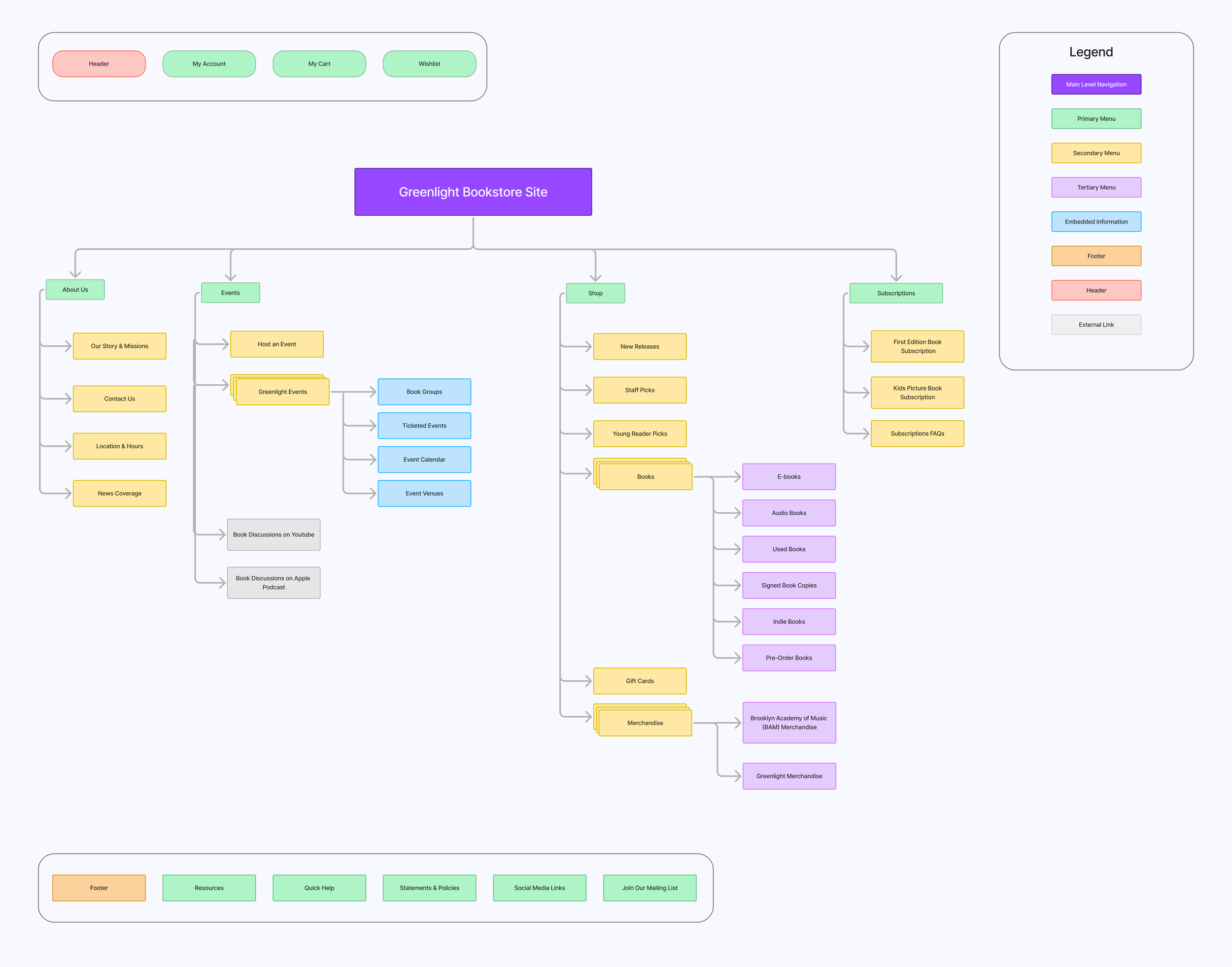
Designing A Clear Information Architecture

Proposed Site Map
Based on the tree testing results, we finalized a new sitemap to optimize the information hierarchy and help users navigate the site smoothly.
Tree Testing
Card Sorting
Before proposing a new information architecture, we conducted a card sorting test with 11 participants to uncover users' mental models of the information architecture of Greenlight bookstore website.
Next, we conducted a tree testing with 15 users to evaluate the effectiveness of our information architecture by assessing how well content is organized and navigated.
We incorporated our strategy and stakeholder’s preferences into the new sitemap.

Testing Our Ideation
Iterations based on users’ feedback
Mid-fidelity desktop and mobile prototypes were created and tested with real users. Multiple iterations and improvements were made through multiple rounds of usability testing.
Iteration 01—Navigating the Home Page
Users said they wanted to read staff book reviews, so we made some changes to the design of the “Staff Picks” section to include real staff book reviews. And, it would be easier for users to differentiate it from the other book recommendation sections on the homepage.
Additionally, users' navigation paths on the homepage indicate that they usually look for the genre first when searching for a book. Therefore, we moved the Genres section to the top to help users find the information they need more efficiently.
Before

After

Users found the book descriptions difficult to read, so we improved the layout by increasing the line spacing. Additionally, users said they were confused between Goodreads' book ratings and the book ratings on the site, so we've reorganized the two types of information to help users better distinguish between them.
Overall, user’s mental model for deciding to buy a book depends largely on whether the book's content is appealing and what other people have said about it. In order to provide them with the same experience as when they browse a book in a physical store, we decided to leave more space for book information.
Iteration 02—Browsing product information
Before

After

Iteration 03—Placing the order

The “Place Order” button was initially located in an unconventional spot on the website's checkout page on the mobile screen, and users struggled to find where to place the order after they finished reviewing their orders. Therefore, we placed this button right after the last section of “Review Order Details” instead, so that users can place their orders right away.
In addition, users expressed a desire for a faster checkout process, so we streamlined the checkout process and gave users the ability to select checkout options up front to meet the needs of different types of customers.
After
Before

